
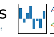
목차
1. matplotlib pyplot 그리기
2. matplotlib pyplot 히스토그램 그리기
3. matplotlib pyplot 스캐터플롯 그리기
4. matplotlib 스타일 설정하기
5. Pandas로 txt 파일 DataFrame 으로 읽어 barplot 그리고 ggplot 스타일로 지정해보기 - Triple Negative Breast Cancer 예제
준비물
1. matplotlib pyplot 그리기
matplotlib 의 pyplot 을 import 해주시고
figure 메서드를 호출하여 fig 변수에 넣습니다
그다음 fig 변수에서 add_subplot 메서드로 sub plot 을 생성해줍니다
괄호에 들어가는 값은 (row 수, column 수, fig 번호 지정) 입니다
1 2 3 4 5 6 7 8 9 10 11 12 13 | ## Matplotlib pyplot 그리기 # subplot 생성 ## Jupyter Notebook의 Magic command로 notebook 내에서 figure를 볼 수 있게 해줌 %matplotlib inline ## matplotlib의 pyplot import import matplotlib.pyplot as plt fig = plt.figure() ax = fig.add_subplot(1,1,1) | cs |

하나의 sub plot 을 생성하였습니다 ㅎㅎ
이번에는 선을 하나 그려볼까요?
plot 메서드로 플롯을 그리며 'k--' 로 검은 점선을 그렸습니다.
k 는 검은 색이며 -- 작대기ㅋㅋ 두 개는 점선을 나타냅니다
1 2 3 4 5 6 7 8 9 10 11 12 13 14 15 16 | ## Matplotlib pyplot 그리기 # plot 그리기 - 점선 ## Jupyter Notebook의 Magic command로 notebook 내에서 figure를 볼 수 있게 해줌 %matplotlib inline ## matplotlib의 pyplot import import matplotlib.pyplot as plt ## numpy random를 import from numpy.random import randn fig = plt.figure() ax = fig.add_subplot(1,1,1) ax.plot(randn(50).cumsum(),'k--') ## plot 메서드로 figure 그림, k-- 는 점선 | cs |

너무 신기신기 ㅋㅋ
이번에는 점선 말고 실선으로 진행해보겠습니다.
k-- 작대기 두개를 작대기 하나로!! k- 로 하면 됩니다.
1 2 3 4 5 6 7 8 9 10 11 12 13 14 15 16 17 | ## Matplotlib pyplot 그리기 # plot 그리기 - 스타일 바꾸기 - 실선 ## Jupyter Notebook의 Magic command로 notebook 내에서 figure를 볼 수 있게 해줌 %matplotlib inline ## matplotlib의 pyplot import import matplotlib.pyplot as plt ## numpy random를 import from numpy.random import randn fig = plt.figure() ax = fig.add_subplot(1,1,1) ax.plot(randn(50).cumsum(),'k-') ## plot 메서드로 figure 그림, k- 는 실선 #ax.plot(randn(50).cumsum(),'k') ## plot 메서드로 figure 그림, k 도 실선 | cs |
실선으로 만들었습니다 ㅎㅎ

이번에는 여러 서브플롯을 그리면서 플롯의 스타일도 설정해보겠습니다
add_subplot 메서드에 (row 개수, column 개수, 편집할 플롯 번호) 를 넣어주심 됩니다.
k 는 black 의 k ... ㄷㄷㄷ
r 은 red 의 r
g 는 green 의 g
b는 blue 의 b ㅎㅎㅎ
RGB 값을 넣으셔도 됩니다
(0.1, 0.2, 0.5) 또는 (0.1, 0.2, 0.5, 0.3) 으로 A 값도 넣어주실 수 있습니다. (alpha, 투명도 ㅎㅎ)
1 2 3 4 5 6 7 8 9 10 11 12 13 14 15 16 17 18 19 20 21 22 23 | ## Matplotlib pyplot 그리기 # plot 그리기 - 스타일 바꾸기 - 색깔 ## Jupyter Notebook의 Magic command로 notebook 내에서 figure를 볼 수 있게 해줌 %matplotlib inline ## matplotlib의 pyplot import import matplotlib.pyplot as plt ## numpy random를 import from numpy.random import randn fig = plt.figure() ax1 = fig.add_subplot(2,2,1) ax2 = fig.add_subplot(2,2,2) ax3 = fig.add_subplot(2,2,3) ax4 = fig.add_subplot(2,2,4) ax1.plot(randn(50).cumsum(),'k') ## k는 black ax2.plot(randn(50).cumsum(),'r-') ## r는 red ax3.plot(randn(50).cumsum(),'g--') ## g는 green ax4.plot(randn(50).cumsum(),'b') ## b는 blue | cs |

짜잔,, 멋지네요
1 2 3 4 5 6 7 8 9 10 11 12 13 14 15 16 17 18 19 20 21 22 23 24 25 26 27 28 | ## Matplotlib pyplot 그리기 # 히스토그램 그리기 ## Jupyter Notebook의 Magic command로 notebook 내에서 figure를 볼 수 있게 해줌 %matplotlib inline ## matplotlib의 pyplot import import matplotlib.pyplot as plt ## numpy random를 import from numpy.random import randn fig = plt.figure() ax = fig.add_subplot(1,1,1) ax.hist(randn(100), bins=20, color='k', alpha=0.3) # ax.hist 메서드로 히스토그램을 그림 # matplotlib.pyplot.hist(x, bins=None, range=None, density=None, weights=None, \ # cumulative=False, bottom=None, histtype='bar', align='mid', \ # orientation='vertical', rwidth=None, log=False, color=None, \ # label=None, stacked=False, normed=None, hold=None, data=None, **kwargs) # bin의 개수 지정 # color 색깔 # alpha 투명도 지정 # 다른 argument에 대한 자세한 내용은 아래 링크 참조 # https://matplotlib.org/api/_as_gen/matplotlib.pyplot.hist.html#matplotlib.pyplot.hist # https://matplotlib.org/api/pyplot_summary.html | cs |

1 2 3 4 5 6 7 8 9 10 11 12 13 14 15 16 17 18 19 20 21 22 23 24 25 26 27 | ## Matplotlib pyplot 그리기 # 스캐터 플롯 그리기 ## Jupyter Notebook의 Magic command로 notebook 내에서 figure를 볼 수 있게 해줌 %matplotlib inline ## matplotlib의 pyplot import import matplotlib.pyplot as plt ## numpy random를 import from numpy.random import randn import numpy as np fig = plt.figure() ax = fig.add_subplot(1,1,1) ax.scatter(np.arange(40), np.arange(40) + 3 * randn(40)) # ax.scatter 메서드로 스캐터 플롯을 그림 # matplotlib.pyplot.scatter(x, y, s=None, c=None, marker=None, \ # cmap=None, norm=None, vmin=None, vmax=None, \ # alpha=None, linewidths=None, verts=None, \ # edgecolors=None, hold=None, data=None, **kwargs) # 다른 argument에 대한 자세한 내용은 아래 링크 참조 # https://matplotlib.org/api/_as_gen/matplotlib.pyplot.scatter.html#matplotlib.pyplot.scatter # https://matplotlib.org/api/pyplot_summary.html | cs |

1 2 3 4 5 6 7 8 9 10 11 12 13 14 15 16 17 18 19 20 21 22 23 24 25 26 27 28 29 | ## Matplotlib pyplot 그리기 # 플롯 스타일 지정하기 - 선 스타일, 색깔, 마커 ## Jupyter Notebook의 Magic command로 notebook 내에서 figure를 볼 수 있게 해줌 %matplotlib inline ## matplotlib의 pyplot import import matplotlib.pyplot as plt ## numpy random를 import from numpy.random import randn import numpy as np fig = plt.figure() fig.set_size_inches(18.5, 10.5) ax1 = fig.add_subplot(3,2,1) ax2 = fig.add_subplot(3,2,2) ax3 = fig.add_subplot(3,2,3) ax4 = fig.add_subplot(3,2,4) ax5 = fig.add_subplot(3,2,5) ax6 = fig.add_subplot(3,2,6) ax1.plot(randn(30).cumsum(), 'k--') ## 그냥 점선 ax2.plot(randn(30).cumsum(), 'ko--') ## 점선 + 마커 ax3.plot(randn(30).cumsum(), 'yo-', markeredgecolor='r') ## 점선 + 마커 테두리색 ax4.plot(randn(30).cumsum(), 'ko-', markerfacecolor='y') ## 점선 + 마커 내부색 ax5.plot(randn(30).cumsum(), label='Default') ## 기본 plot ax6.plot(randn(30).cumsum(), drawstyle='steps-post', label='steps-post') ## 계단식 plot | cs |

1 2 3 4 5 6 7 8 9 10 11 12 13 14 15 16 | ## Pandas와 Matplotlib pyplot 으로 차트 그리기 # csv 파일 읽어 DataFrame에 넣기 ## Jupyter Notebook의 Magic command로 notebook 내에서 figure를 볼 수 있게 해줌 %matplotlib inline ## matplotlib의 pyplot import import matplotlib.pyplot as plt ## pandas import 하기 import pandas as pd from pandas import DataFrame ## comma로 구분된 파일을 읽어 pandas DataFrame 객체에 넣기 df = DataFrame.from_csv("GeneExpression.txt",sep=",") print(df) | cs |

1 2 3 4 5 6 7 8 9 10 11 12 13 14 15 16 17 18 | ## Pandas와 Matplotlib pyplot 으로 차트 그리기 # DataFrame을 barplot으로 그리기 ## Jupyter Notebook의 Magic command로 notebook 내에서 figure를 볼 수 있게 해줌 %matplotlib inline ## matplotlib의 pyplot import import matplotlib.pyplot as plt ## pandas import 하기 import pandas as pd from pandas import DataFrame ## comma로 구분된 파일을 읽어 pandas DataFrame 객체에 넣기 df = DataFrame.from_csv("GeneExpression.txt",sep=",") ## barplot 그리기 ax = df.plot(kind='bar') | cs |
 ㅎㅎ
ㅎㅎ1 2 3 4 5 6 7 8 9 10 11 12 13 14 15 16 17 18 19 20 21 22 23 24 25 26 27 28 29 30 31 | ## Pandas와 Matplotlib pyplot 으로 차트 그리기 # title, x축 라벨, y축 라벨, 레전드 위치 설정하기 ## Jupyter Notebook의 Magic command로 notebook 내에서 figure를 볼 수 있게 해줌 %matplotlib inline ## matplotlib의 pyplot import import matplotlib.pyplot as plt ## pandas import 하기 import pandas as pd from pandas import DataFrame ## comma로 구분된 파일을 읽어 pandas DataFrame 객체에 넣기 df = DataFrame.from_csv("GeneExpression.txt",sep=",") ## barplot 그리기 ax = df.plot(kind='bar') ## title 넣기 ax.set_title("Gene Expression", fontsize=20) ## x축 label 수정하기 ax.set_xlabel("Triple negative genes") ## y축 label 수정하기 ax.set_ylabel("FPKM") ## legend 위치 조정 ax.legend(loc='best') | cs |

1 2 3 4 5 6 7 8 9 10 11 12 13 14 15 16 17 18 19 20 21 22 23 24 25 26 27 28 29 30 31 32 33 34 | ## Pandas와 Matplotlib pyplot 으로 차트 그리기 # 플롯 스타일 바꿔보기 ## Jupyter Notebook의 Magic command로 notebook 내에서 figure를 볼 수 있게 해줌 %matplotlib inline ## matplotlib의 pyplot import import matplotlib.pyplot as plt ## pandas import 하기 import pandas as pd from pandas import DataFrame ## ggplot style로 바꾸기 plt.style.use('ggplot') ## comma로 구분된 파일을 읽어 pandas DataFrame 객체에 넣기 df = DataFrame.from_csv("GeneExpression.txt",sep=",") ## barplot 그리기 ax = df.plot(kind='bar') ## title 넣기 ax.set_title("Gene Expression", fontsize=20) ## x축 label 수정하기 ax.set_xlabel("Triple negative genes") ## y축 label 수정하기 ax.set_ylabel("FPKM") ## legend 위치 조정 ax.legend(loc='best') | cs |

'컴퓨터 > Python' 카테고리의 다른 글
| [python] 파이썬 사전 딕셔너리 값 value 로 정렬하는 방법 - lambda 식 응용 - 파이썬으로 단어 수 세기, 텍스트에서 가장 많이 출현한 단어 세기 (2) | 2018.07.05 |
|---|---|
| [파이썬] 딕셔너리 사전 합치기 - 여러개 딕셔너리 합치기 (0) | 2018.07.03 |
| [pandas] 판다스 파이썬으로 엑셀 만들기 - DataFrame을 헤더 서식 적용하여 엑셀 파일 만들기 (0) | 2018.06.02 |
| [pandas] 판다스 파이썬으로 엑셀 만들기 - DataFrame을 숫자 서식 적용하여 엑셀 파일 만들기 (0) | 2018.06.02 |
| [pandas] 판다스 파이썬으로 엑셀 만들기 - DataFrame을 날짜 서식 적용하여 엑셀 파일 만들기 (0) | 2018.06.02 |


댓글